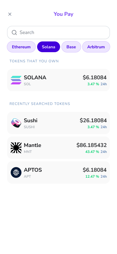


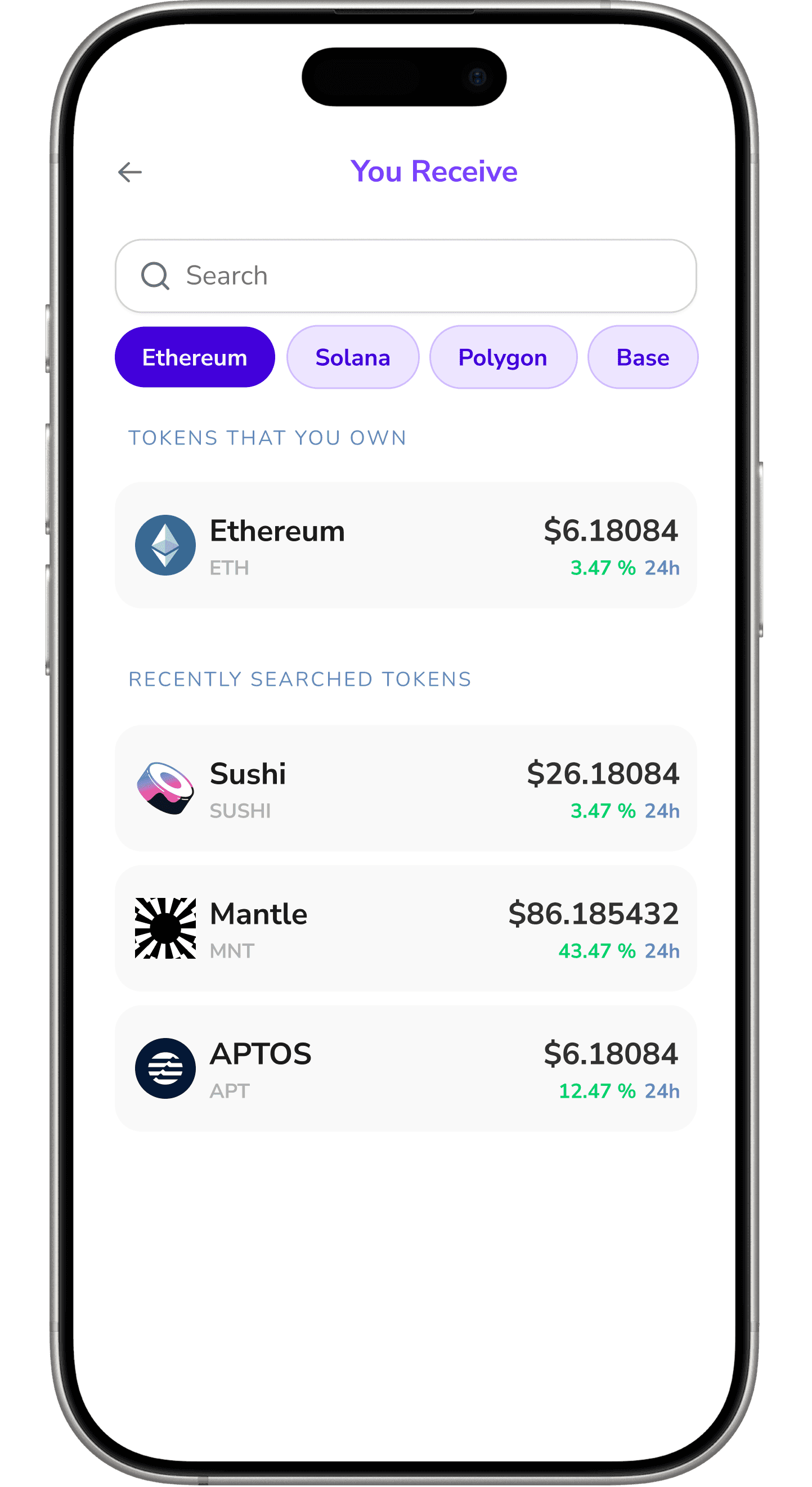

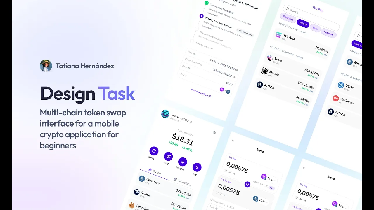
🧩 Swap, Simplified
A lightweight interface with smart defaults and no jargon.
Just: “I want to swap this → into that.” Everything else? Handled invisibly.
One of the biggest takeaways from this project was realizing that the problem isn’t always the complexity of the technology — it’s the language we use to describe it. Concepts like bridging, gas, or slippage aren’t inherently bad, but they’re rarely explained in ways that feel relevant or human. When I focused on translating these into natural, empathetic language — without dumbing them down — users felt less intimidated and more in control. It’s not about hiding complexity, but framing it in a way that feels approachable.
Design Sets the Tone Before You Say a Word
Throughout this flow, I realized that visual design choices — spacing, icons, copy tone, animations — play a subtle but powerful role in shaping the user’s emotional state. A swap is more than a transaction; it’s a moment of trust. So I designed for feelings: calmness, clarity, momentum. That meant removing anything noisy or ambiguous, and reinforcing progress through soft animations and encouraging language. The goal wasn’t just usability — it was confidence.
First impressions are emotional, not technical.
For someone new to crypto, the first few screens of an app can shape their entire relationship with the product — or even the ecosystem. I learned to treat those initial interactions with care: make it welcoming, predictable, and helpful. If the first impression feels like a test, users walk away. But if it feels like support, they lean in. That’s why early steps in the flow focus more on reassurance than control. Before asking for wallet permissions, I ask for attention — and earn it.