Moralis • Concept 2024
Bridge the Gap
Turning cross-chain swaps into a confident first step into crypto
Role
Product Designer
Timeline
2024
Team
Solo concept
Skills
Mobile Design
Web3 / DeFi
UX Writing
Overview
DeFi is full of promise — and full of friction.
For many new users, their first encounter with decentralized finance is also their last. Between gas fees, wallet approvals, bridges, and block explorers, even a basic token swap becomes a maze of confusion. And if the swap happens between chains? The drop-off is near total — unless we redesign the rules.
The opportunity
DeFi adoption is growing, but UX is the single biggest barrier to entry for non-technical users. Most people who try it once never come back — not because of the technology, but because of how it makes them feel.
My role
Design a mobile cross-chain swap experience from concept to handoff, with a focus on trust, plain language, and zero anxiety — making DeFi accessible to anyone, not just those already fluent in it.
The User
Designing for the crypto-curious newcomer.
Not the power trader managing a multi-chain portfolio — the person who just bought their first $20 in ETH and wants to explore what comes next. This is who we designed for.
What they know
Heard of Bitcoin, maybe has a Coinbase account. Knows "blockchain = something secure." Has no mental model for what a bridge, a gas fee, or a token approval actually does.
What they fear
Sending funds to the wrong address. Losing money to gas without understanding why. Not knowing what they're approving. The feeling of being one wrong tap away from losing everything.
What they need
Confidence at every step. Plain language, not jargon. Clear feedback that tells them what's happening and why. No dead ends, no black boxes, no moments that feel like a trap.
The user isn't intimidated by crypto — they're intimidated by feeling stupid about crypto.
Challenge & Approach
This wasn't just a UI problem — and the solution wasn't either.
Before opening Figma, I walked through five existing cross-chain interfaces as a first-time user. Three distinct layers of friction emerged. Each one is manageable alone — together, they create a wall. The benchmark below captures exactly where existing products break down.
A trust problem
Hidden steps — bridge approvals, gas estimation, route selection — create anxiety at every turn. Users can't tell if they're completing a transaction or accidentally losing their funds.
A language problem
"Slippage", "gas", "bridge", "approval" — the vocabulary of DeFi was built by engineers, not for people. These concepts aren't inherently bad, but they're rarely framed in ways that feel human.
A confidence problem
The first impression of a DeFi app shapes the user's entire relationship with the product. A single confusing moment early in the flow is enough to lose them permanently.
Walked through 5 existing cross-chain interfaces as a first-time user. Documented every hidden step — then designed for radical transparency at each one.
Before designing any screen, I rewrote every key term in plain language. "Approve token" → "Allow this app to use your token." Language-first, then UI.
Each step was mapped to a target emotional state: confusion → clarity → trust → confidence. Every visual and copy decision served that arc.
DeFi doesn't need to be simplified — it needs to be translated.
Solution
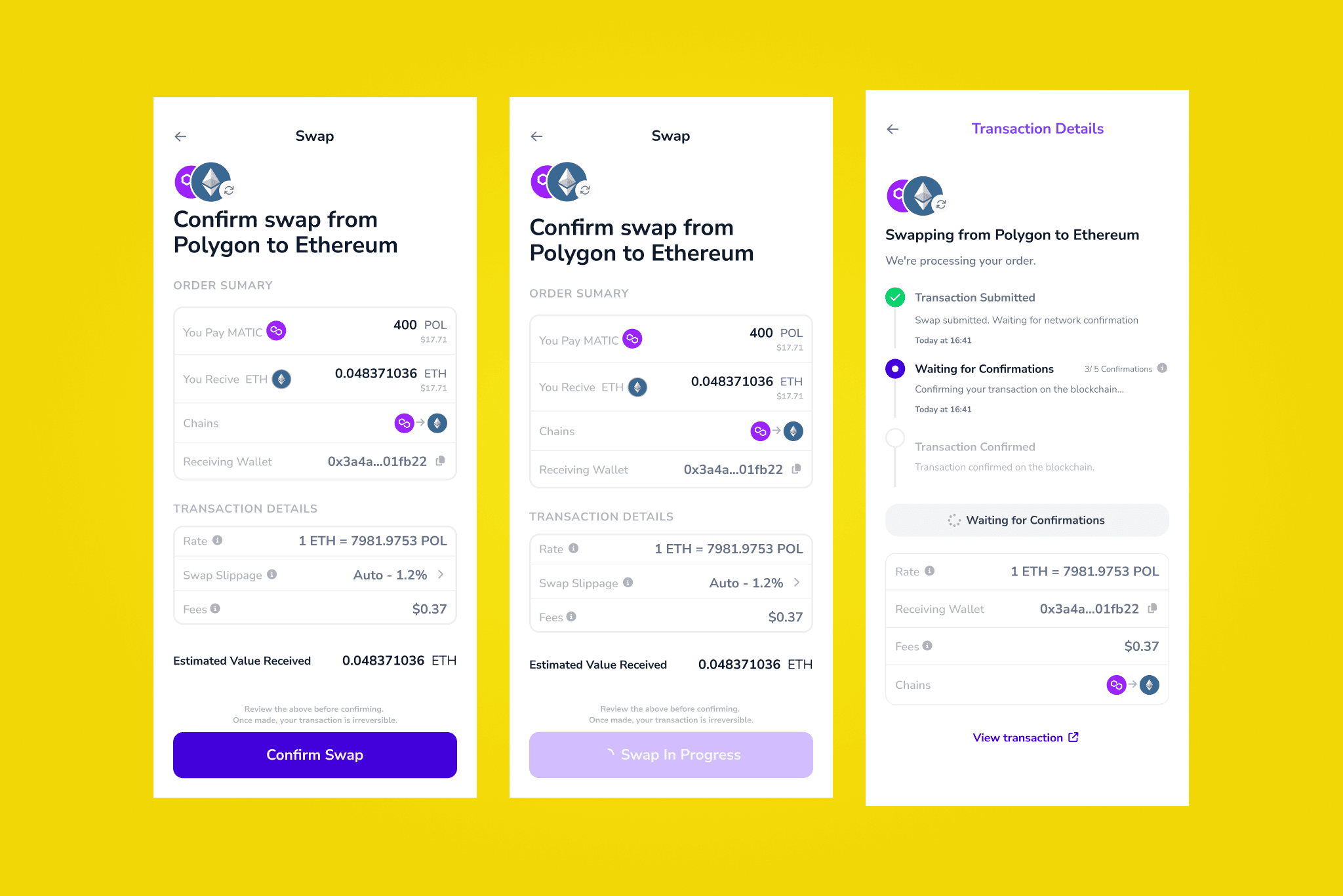
A step-by-step swap experience that earns trust at every click.
The app guides users through a cross-chain swap using plain language, real-time feedback, and visible progress — reducing confusion and building confidence at each stage of the flow.
Smart defaults, no jargon
Pre-filled routes, estimated outcomes, no technical choices pushed to the user unless necessary. The interface asks one thing at a time: "I want to swap this → into that." Everything else is handled invisibly.
Visible progress
Each step shows what's happening and why. No black boxes — users see the bridge route, the gas estimate, and the expected outcome before confirming anything. Transparency as a trust signal.
Earned permissions
Wallet approvals are introduced with context, not as a cold popup. The app explains what it's asking for and why before requesting it — because permission without context feels like a threat.
Key design decision: step-by-step over all-at-once
The initial instinct was to show a full swap summary upfront — a common pattern in DeFi interfaces. But after testing both approaches, step-by-step consistently outperformed. It felt slower, but users arrived at the confirmation step already informed rather than suddenly overwhelmed. The friction was worth it.
Design Handoff
Bridging design and engineering.
This project is a real-world example of how I structure and present a design handoff in a freelance context. My approach focuses on bringing clarity to dev teams, answering questions before they're asked, and maintaining living documentation that connects design decisions to product strategy — not just a Figma file with measurements.
Annotated specs
Every component includes interaction notes, edge cases, and the reasoning behind design decisions — not just measurements. A dev reading the file should understand not just what to build, but why it works this way.
Pre-answered questions
Before sharing the file, I walked through it as a developer and documented every "wait, what happens if...?" scenario I encountered. Empty states, error states, loading states — covered before they become blockers.
Living documentation
Handoff files are organized by user flow, not screen number. Built to stay usable after the first review — so when a developer comes back to it three weeks later, they can still find what they need.
A good handoff doesn't just describe the design — it defends it.
Impact & Learnings
What it validated — and what it taught me.
Concept project — no production metrics, but validated through concept testing with non-crypto users across different levels of technical familiarity. Here's what came out of it.
Reduced cognitive load
In concept testing, users completed the swap flow without stopping to ask "what does this mean?" — a first for most of them in a DeFi context. The plain-language rewrites eliminated the most common friction points before they became drop-off moments.
Trust signals worked
Users described the confirmation step as "reassuring" rather than "scary" — the primary emotional goal of the project. The visible progress model and earned permissions pattern directly shaped how safe users felt at the most high-stakes moment in the flow.
Handoff format adopted
The annotation and documentation structure developed for this project was adopted by the client team as their standard handoff format — extending the impact of the work beyond the project itself.
Three things this project taught me about designing for complex technical spaces.
DeFi doesn't need to be simplified — it needs to be translated.
The problem isn't the complexity of the technology — it's the language used to describe it. When I focused on translating concepts into natural, empathetic language — without dumbing them down — users felt less intimidated and more in control.
Design sets the tone before you say a word.
Spacing, icons, copy tone, animations — these shape the user's emotional state before they've read a single instruction. A swap is more than a transaction; it's a moment of trust. I designed for feelings: calmness, clarity, momentum.
First impressions are emotional, not technical.
The first few screens of a crypto app shape a user's entire relationship with the product. If the first impression feels like a test, users walk away. If it feels like support, they lean in.