
The challenge
At Renfe they have realized that they lose many users in the process of selling tickets online on their mobile website.
They want to find out what are the main problems that their users have and improve the user experience.
Process
Empathize
Define
Ideate
Prototype
Test
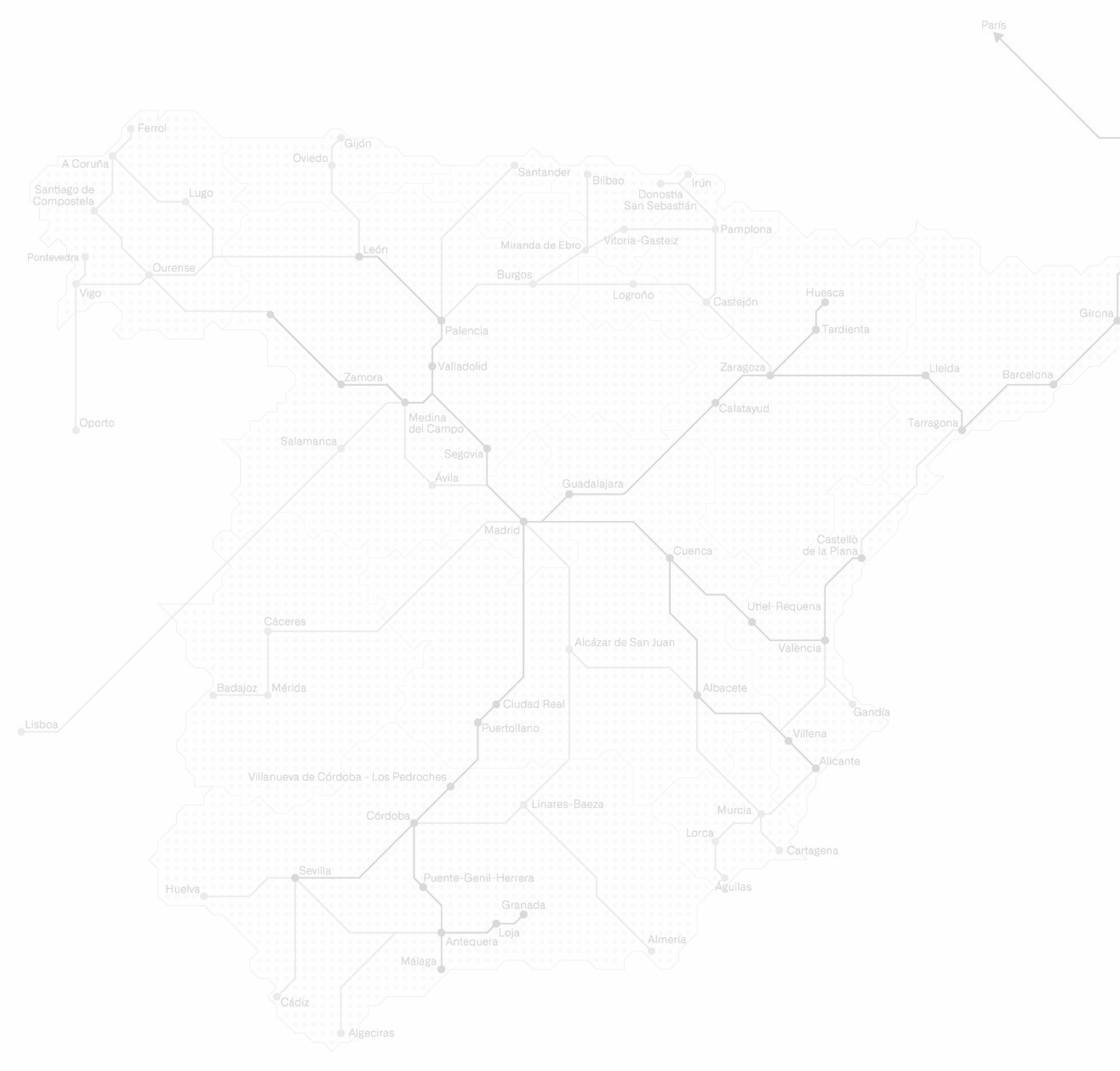
Journey Map

Catherine
30 years
Sevilla


Stage
Booking
of tickets
Selection of the
travel preferences
Entry
Passenger Data
Choice
payment method
Pain Points
1
2
3
14
15
4
5
10
11
12
13
6
7
8
9
“It is not clear to me if the filters that have been selected have been applied to the search.”
“No option appears for me by city, it seems that the page has not loaded completely.”
“Where is the space where I can confirm the data and the reservation? It is almost invisible and if I change any data again, I lose all the search? Should I start over?
At times like this I prefer to wait and try again later.
“what a long and inefficient form, I will take too long”
This option is very hidden, in other trips I have forgotten to select it
I should be able to choose the seat like on airplanes
The information should autofill with what I have previously put in the form and if I put a card I should not be redirected to another page, this does not give me confidence
Possible drop point
Frequent errors occur in the selection of routes that generate doubt in users.
The process only allows you to start the entire search again.
The user has no one to turn to
Possible drop point
The form section is perceived as an element that will give rise to possible errors and delay in execution and payment times.
The steps are not clear.
It is perceived as a list where it is not known which fields are mandatory and apparently unnecessary information is requested.
The seat options are not clear, it does not offer punctual seat selection, this in the execution of the trip makes the user take a long time to look for it in the car
The use of filters is a simple process but the way it is proposed becomes a complex process to understand.
The lack of options in the first instance generates confusion in the execution of the task.
When the cities appear, too many options are offered without hierarchy: Example “MADRID ALL”

web móvil


1
3
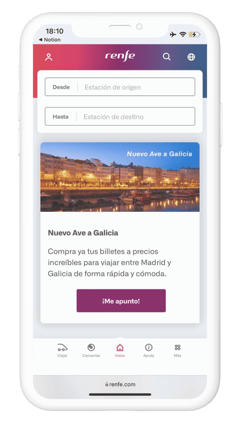
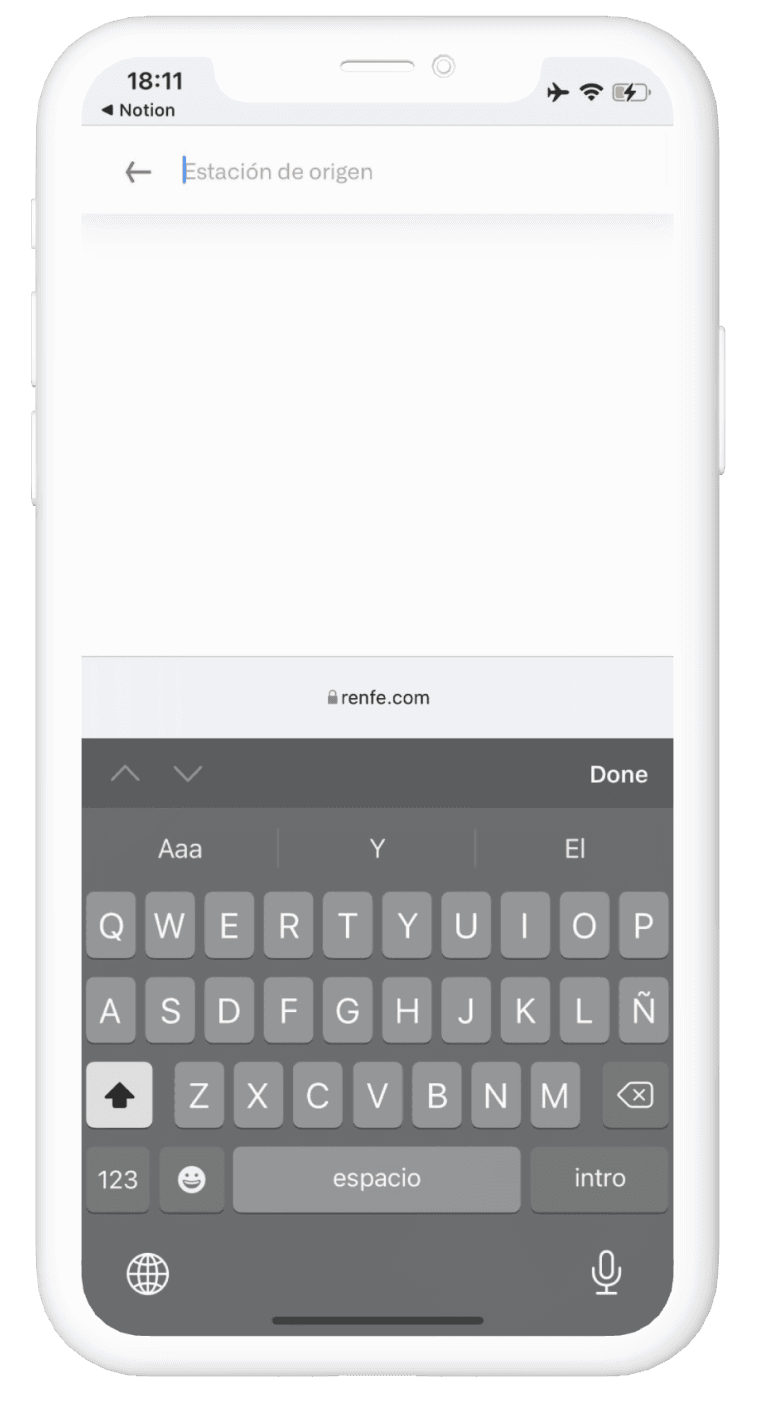
Initial appearance that the page has not finished loading. The most frequent destinations could be suggested by default.
It does not have a button that invites you to start the search. It does not allow you to configure travel options and preferences from the initial stage.
The use of icons is useful but they are not very recognizable for the user
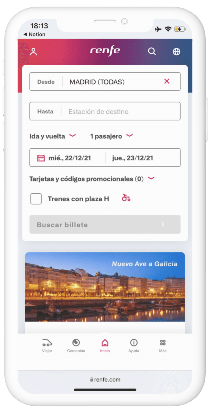
Filter pop-up cards have microinteractions that are not consistent.
The trip setup stage appears after the destination search.
In Spanish, the copy of “trenes con plaza H” generates confusion because it is not explained beforehand what term it refers to. In English the copy is explanatory
There is an advertising banner that can be confusing for the user.

Reservation of tickets and selection of travel preferences
STAGE 1

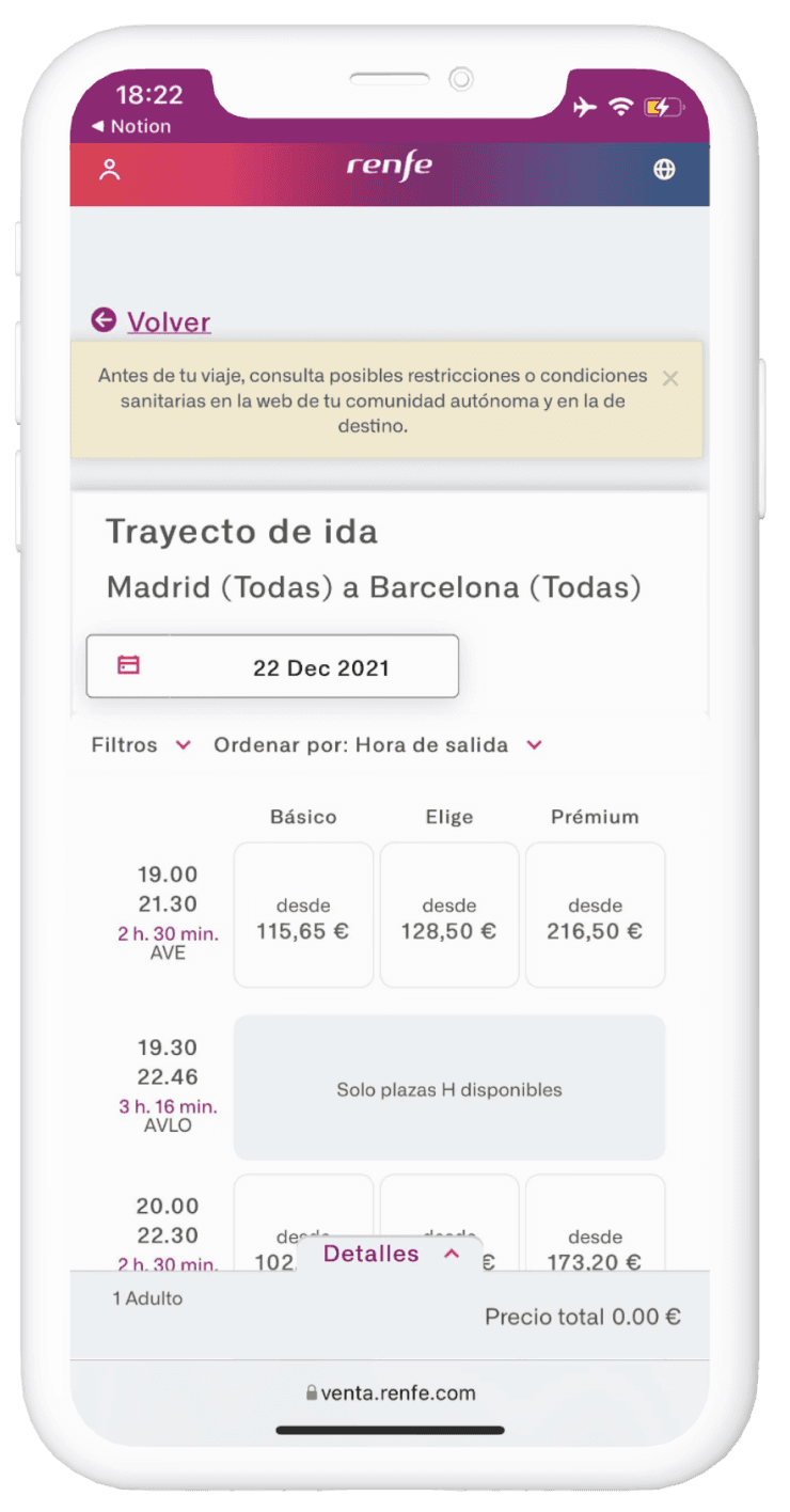
The purchase process does not have a defined graphic hierarchy.
This makes the purchase steps unclear, giving room for error and the generation of insecurity and possible abandonment of the process.
The Button to execute the action that has been carried out does not have the size, nor the hierarchy necessary to carry out this type of action.
It is constituted as an element that contributes to user confusion in the purchase process.
This option appears very small and in a position that goes unnoticed
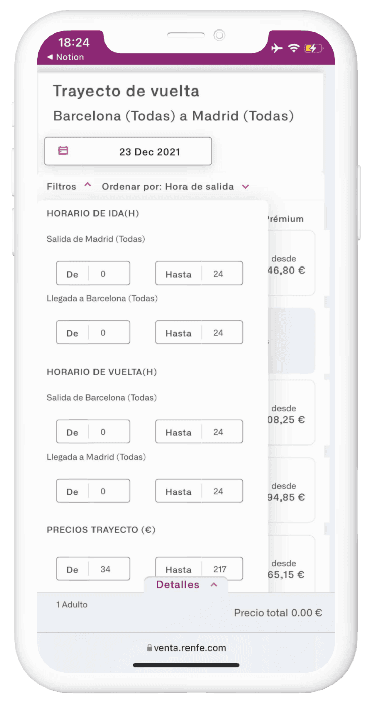
When selecting the filters option, unclear and overly complex options appear.
In turn, the pop-up card overlaps with the information on the main screen, making it look like information and confuse the user (there is a double scroll).
The option to enter the date appears with numerical configuration.
4
5
6
Ticket selection and purchase
STAGE 2

Ideate
Wireflow

Case Study

The proposal in high-quality wireframes the redesign of the interaction and the Renfe mobile web navigation system

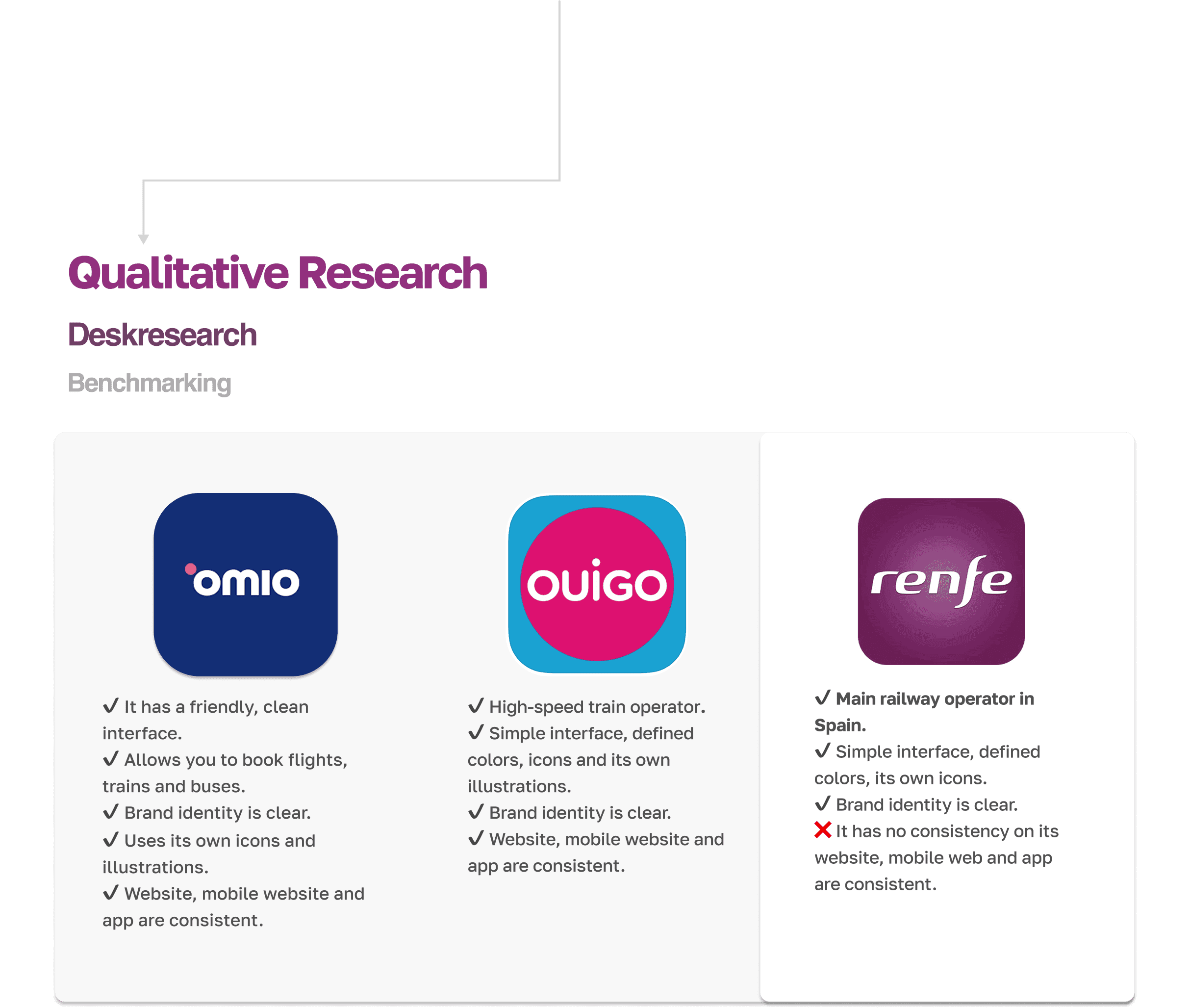
Qualitative Research
Deskresearch
Benchmarking

✔️ It has a friendly, clean interface.
✔️ Allows you to book flights, trains and buses.
✔️ Brand identity is clear.
✔️ Uses its own icons and illustrations.
✔️ Website, mobile website and app are consistent.
✔️ High-speed train operator.
✔️ Simple interface, defined colors, icons and its own illustrations.
✔️ Brand identity is clear.
✔️ Website, mobile website and app are consistent.

✔️ Main railway operator in Spain.
✔️ Simple interface, defined colors, its own icons.
✔️ Brand identity is clear.
❌ It has no consistency on its website, mobile web and app are consistent.
Define
Identifying what to improve
Jakob Nielsen's Heuristic Principles
The form has fields that you could do without.
The size of the fields is too small.
There is no hierarchy of information
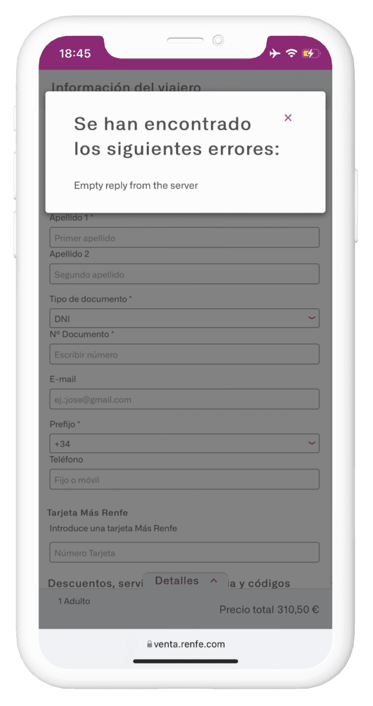
It is not clear at a visual level, which fields have an error before clicking CONTINUE, it is only known where an error has been made at the end of the entire process. Sometimes the errors are not descriptive as in this image.
The selection of payment method forces to repeat information that should be auto-completed or omitted and if anything, allow the user to change it when he considers it. The fields are very small and do not use icons that facilitate their understanding. The entry of the card data is done on a different page instead of on the same form.
STAGE 3
Entry of Passenger Data and Payment process


7
8
Empathize
User Persona
Renfe is a company that offers mass transportation for public use and covers a very diverse community of travelers, within which the following archetypes of person are highlighted to identify specific characteristics
That train tickets are so expensive on certain days of the week, she does not understand why it is so expensive when the service is so poor
WHAT SHE IS FRUSTRATED
She studies communication and loves to be aware of trends in audiovisual media, she takes advantage of public transport times to catch up on social networks
WHAT SHE SAYS AND DOES
Have new experiences, and discover the city with her friends.
WHAT MOTIVATES HER
She sees the train as a quick way to get around, she can spend the weekend in Madrid with her friends in just an hour and a half.
WHAT SHE THINKS AND FEELS
Zaragoza
Violeta, 23 years

The purchase process from his phone, when he cannot do it with peace of mind from home
WHAT HE IS FRUSTRATED
The train is his new office, he moves between cities to visit clients. He says that the train should have the option of a meeting room to take advantage of the trips
WHAT HE SAYS AND DOES
Taking advantage of the time of the journey to organize work meetings. Finding rates at reasonable prices and making purchase and reservation process quick and easy.
WHAT MOTIVATES HIM
Seeing the train as his new form of transport, he has been living in other countries and is very proud of the railway system in Spain
WHAT HE THINKS AND FEELS
Barcelona
Raúl, 35 years

She is frustrated by feeling outdated with technology, having to relearn processes on a page that she had already mastered when buying her train tickets.
WHAT SHE IS FRUSTRATED
She goes out with her friends to visit the nearby provinces and prefers to do it by train, thus giving them time to talk and share experiences. She is trying to develop a bog of restaurants in her region.
WHAT SHE SAYS AND DOES
Discover restaurants in nearby provinces to be able to take their children when they visit.
WHAT MOTIVATES HER
She loves visiting her grandchildren and having her grandchildren visit her. She feels that with the train she can have them closer and there are no transportation barriers. She is recently retired and she feels that it is time to discover her region.
WHAT SHE THINKS AND FEELS
Santander
Veronica , 65 years

The variety of types of train tickets, and the lack of clarity in the descriptions, their purchase process is confusing, the limited offer of companies that provide the train service.
WHAT SHE IS FRUSTRATED
Thanks to her work she can travel the world. This year she has decided that she will live each season of the year in a different city in Spain and will try to visit as many provinces as possible.
WHAT SHE SAYS AND DOES
Discover each city, and be able to work while she does it.
WHAT MOTIVATES HER
She has decided to travel all over Spain and live in its main cities. She feels that the train system lacks a bit of order and does not understand much about the purchasing processes.
WHAT SHE THINKS AND FEELS
Irlanda
Catherine , 30 years


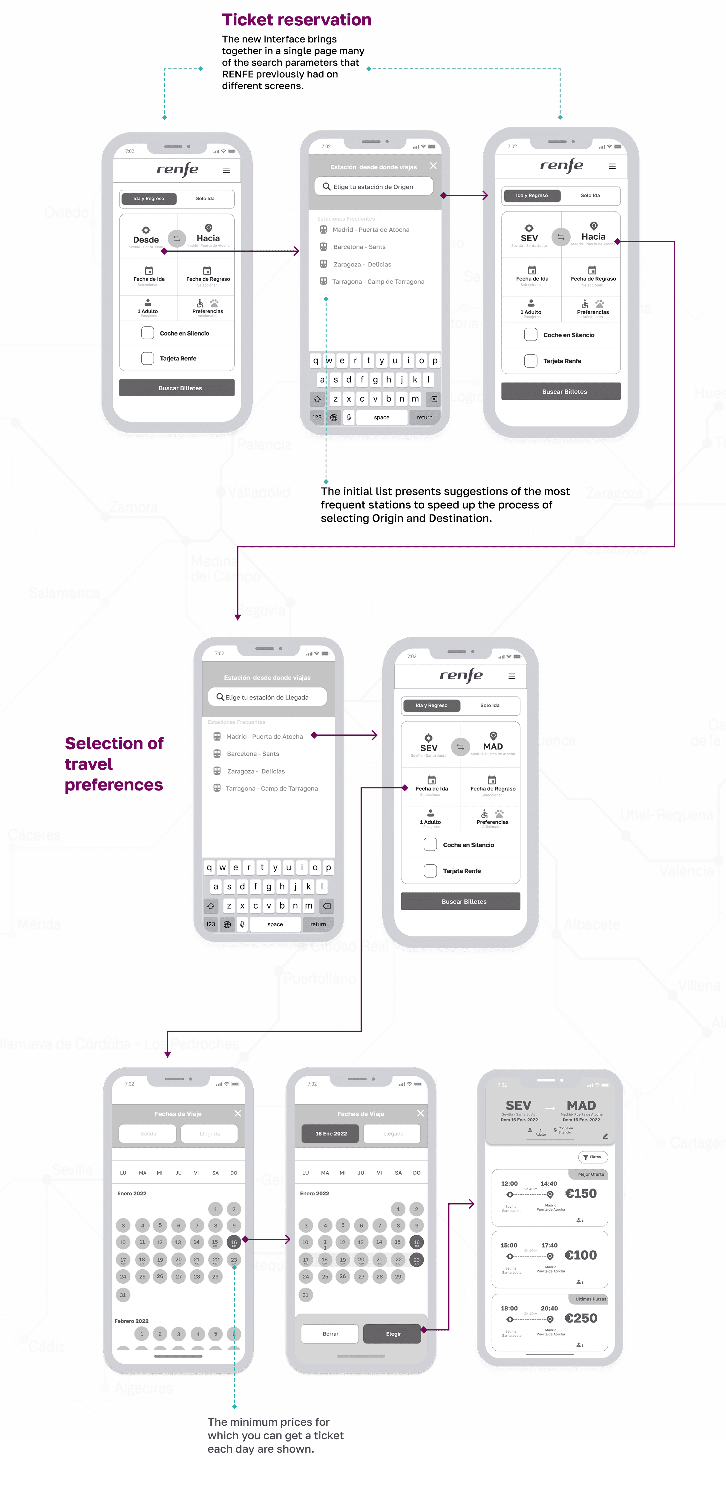
Ticket reservation
The new interface brings together in a single page many of the search parameters that RENFE previously had on different screens.
The initial list presents suggestions of the most frequent stations to speed up the process of selecting Origin and Destination.
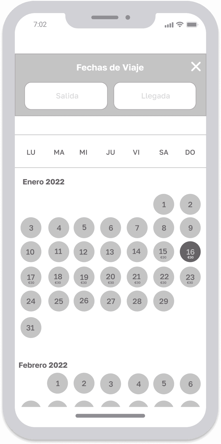
Selection of travel preferences

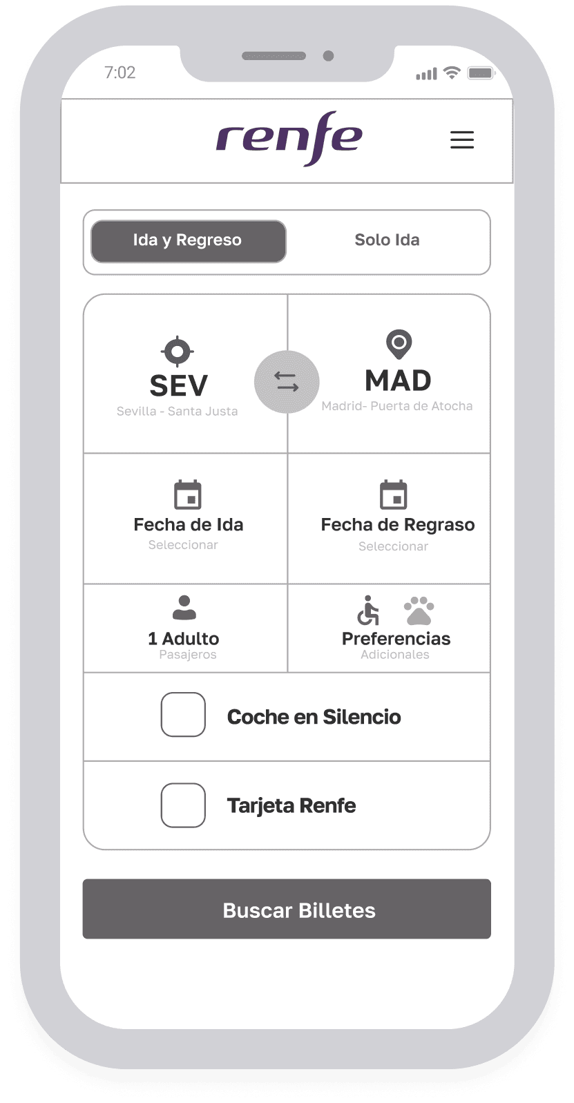
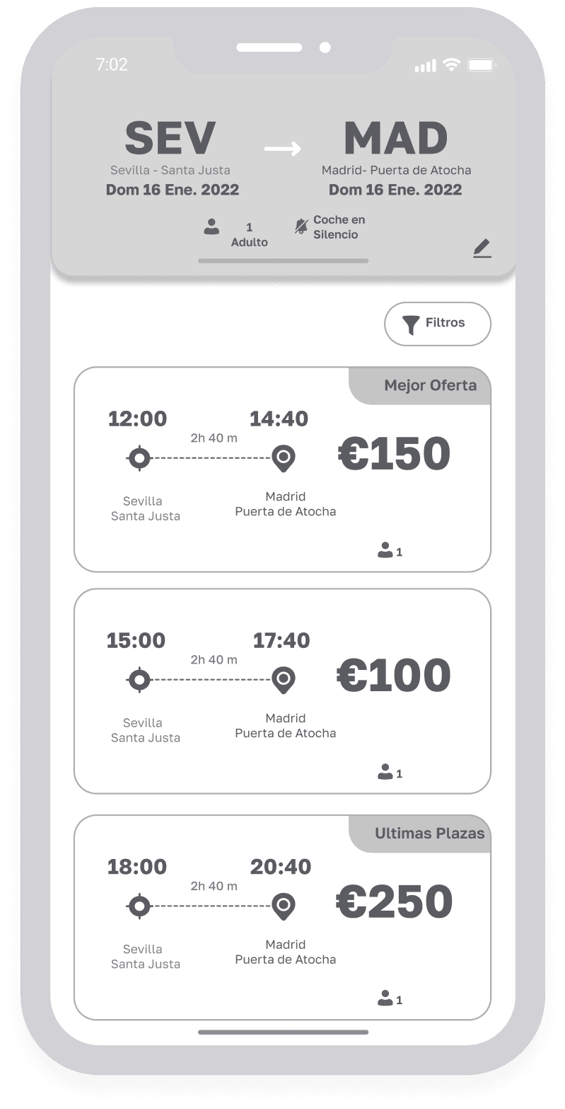

Through labels such as "Best Offer" and "Last Places" the user is pushed to select.
Through this header, the user is clearly reminded of what they are buying.

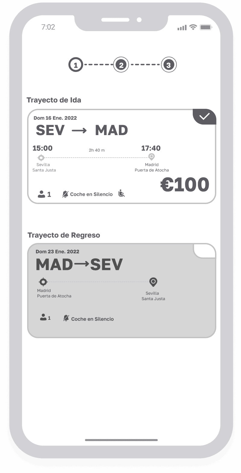
At a glance, the user can confirm that all the data is correct or modify the possible errors that he has made.

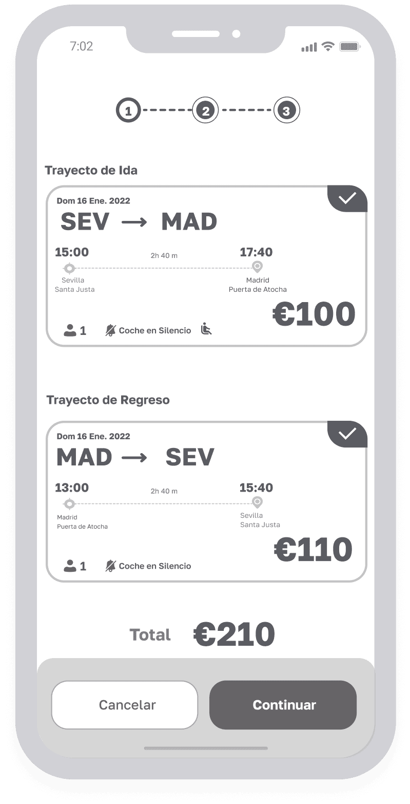

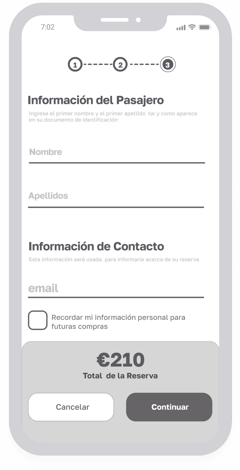
Passenger Data
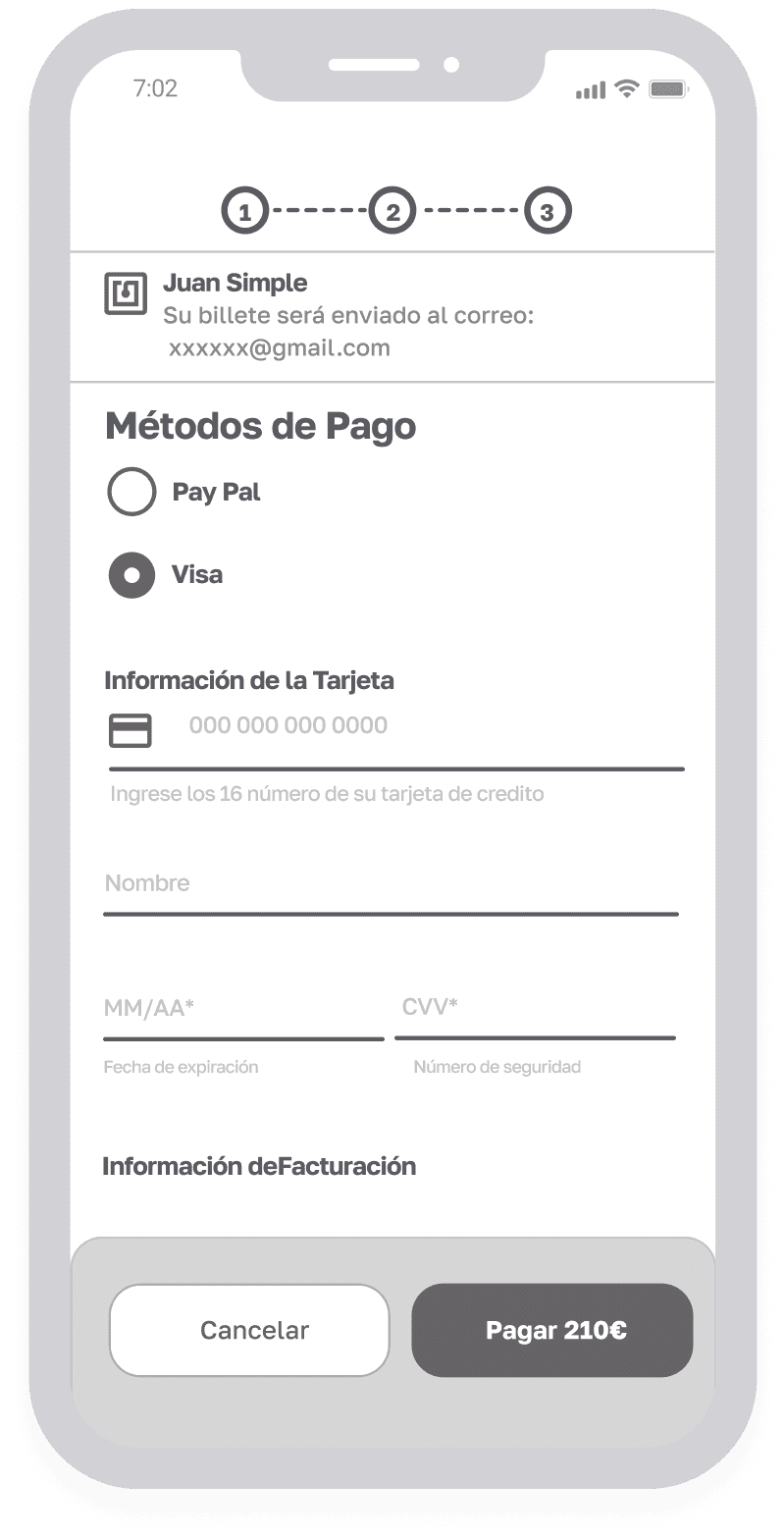
Pay of the reserve
The card information is entered on the same page without redirections that can make the user nervous.
The card format is verified live as it is written to detect possible errors.
The billing information is as auto-completed as possible to avoid the user having to type it twice.
Only the essential information is requested. These inputs should go with live error handling that directly mark detected errors as information is typed in instead of waiting for the user to hit CONTINUE.

Case Study

The proposal in high-quality wireframes the redesign of the interaction and the Renfe mobile web navigation system
The challenge
At Renfe they have realized that they lose many users in the process of selling tickets online on their mobile website.
They want to find out what are the main problems that their users have and improve the user experience.
Process
Empathize
Define
Ideate
Prototype
Test


Define
Identifying what to improve
Jakob Nielsen's Heuristic Principles

Ideate
Wireflow

Let´s connect
Have questions about this project? Interested in discussing a new project or sharing new ideas?
I’d love to connect! Drop me a message, and let’s create something great together! 🚀
Let´s connect
Have questions about this project? Interested in discussing a new project or sharing new ideas?
I’d love to connect! Drop me a message, and let’s create something great together! 🚀
© 2025 thebell. All rights reserved.
© 2025 thebell. All rights reserved.