Ux Flow
2021
Improving repurchase UX flow on retail


retial.com


retail.com
THE GOAL
Help store managers understand a repurchase scenario by showing them which products should be re-ordered and which should not.

Understanding the user

url.com
Laura Mazurek
STORE MANAGER AT PIMKIE
Priorities
☝️ Identifing which products should be re-ordered and in what quantity.
Pain points
🔎 Not being aware of the MOQ status of each product.
⏰ Having to spend time looking at complex dashboards trying to understand the inventory forecast and next actions she should take.
Goals
👩🏻💻 Estimate the amount of products to order from supplier
🎯 Identify which products are not recommended to order because the sales forecast is lower than the minimun quantity requested by the supplier or because the profitability of the escenario is not good.
"I want to make the summer dress order with enough time so that I can optimize sales and focus on other tasks."
"I want to spend as little time as possible making the re-order of items I already know that work well so that I can focus on our new collection order."

url.com

Analyzing pain points

url.com
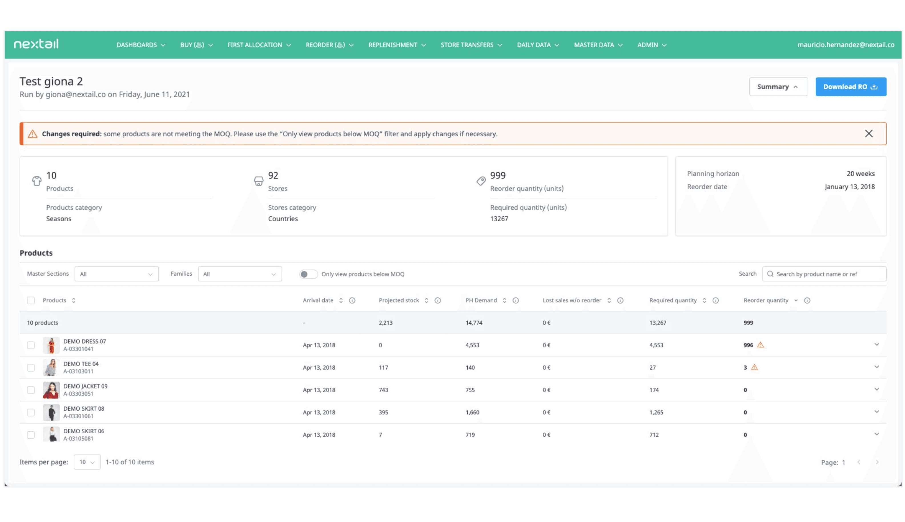
This information is very static and it occupies the most important space of the dashboard.
This space can be optimized.


url.com
These alerts are very minimal, it is easy to miss them. Also they do not look clickable so at a glance the user might now know what do with them.

url.com
Actions are not clear. Are these buttons or warnings? Are they clickable?
How is the hover tooltip displayed on mobile?
Filters occupy important space, are users using them?


url.com
This expandable rows push the other rows up and down causing Layout Shift.
This can be distracting and make the user get lost frequently.


url.com
url.com

url.com
url.com
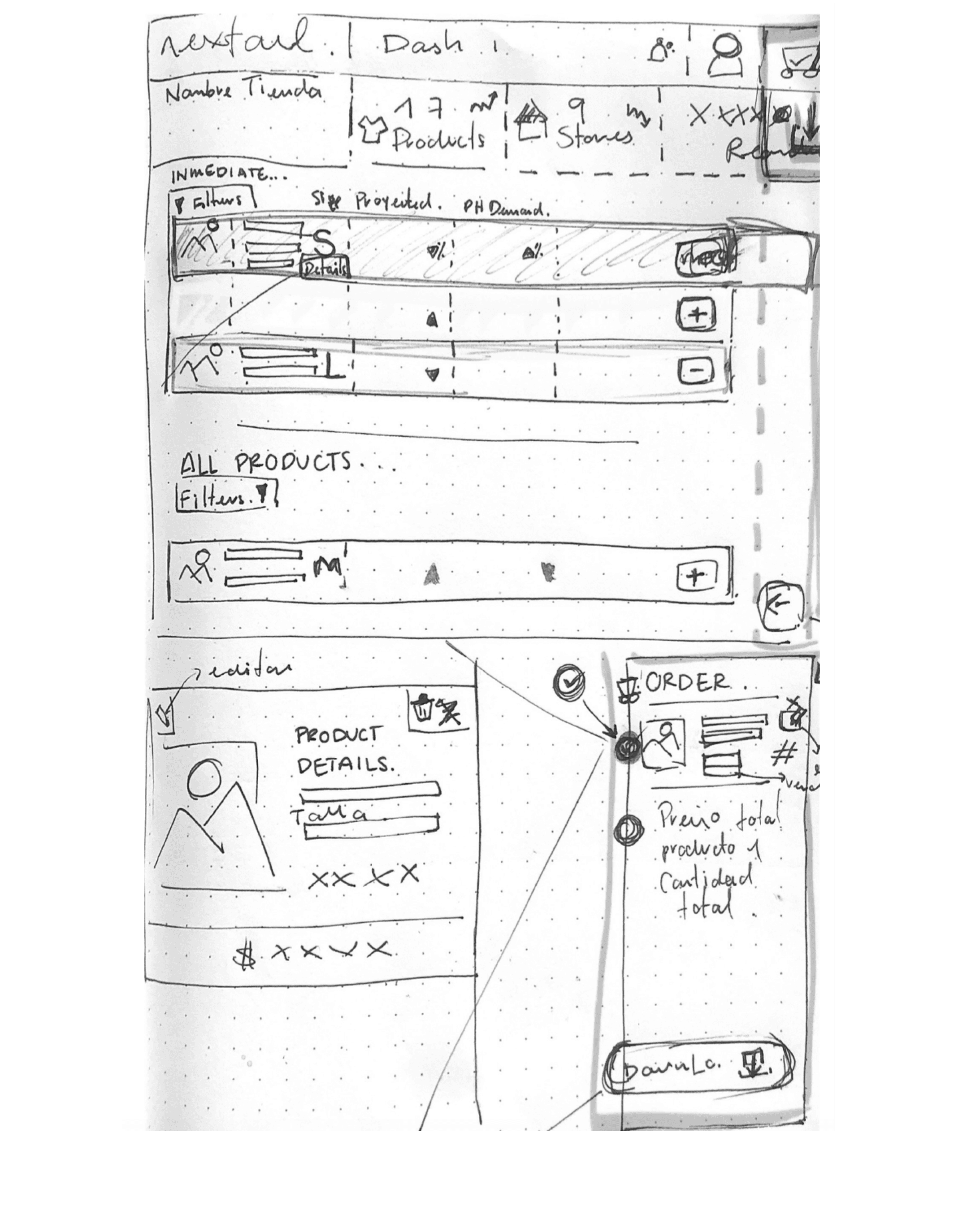
WIREFRAMING AND PROTOTIPYNG PROCESS
New Proposal
url.com
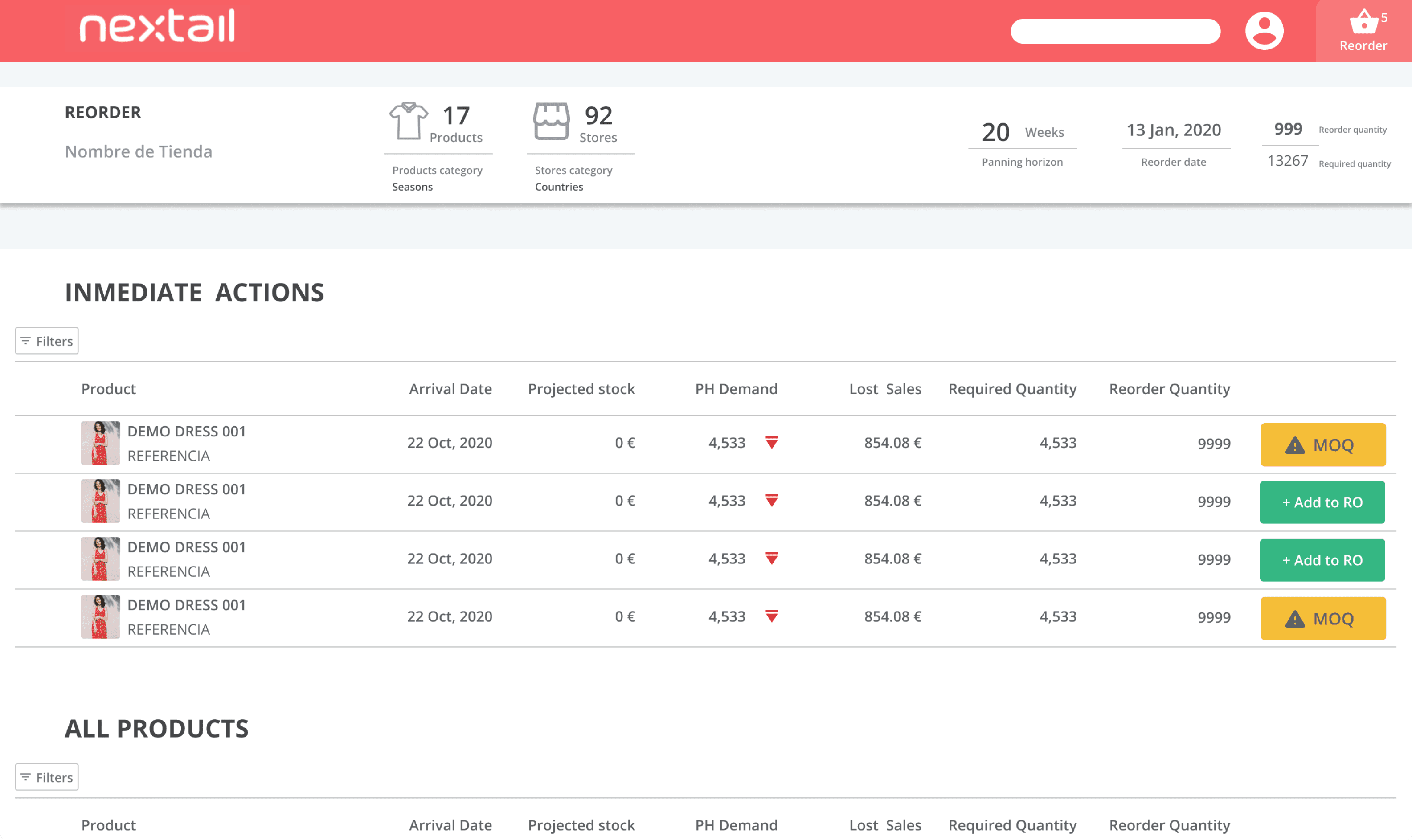
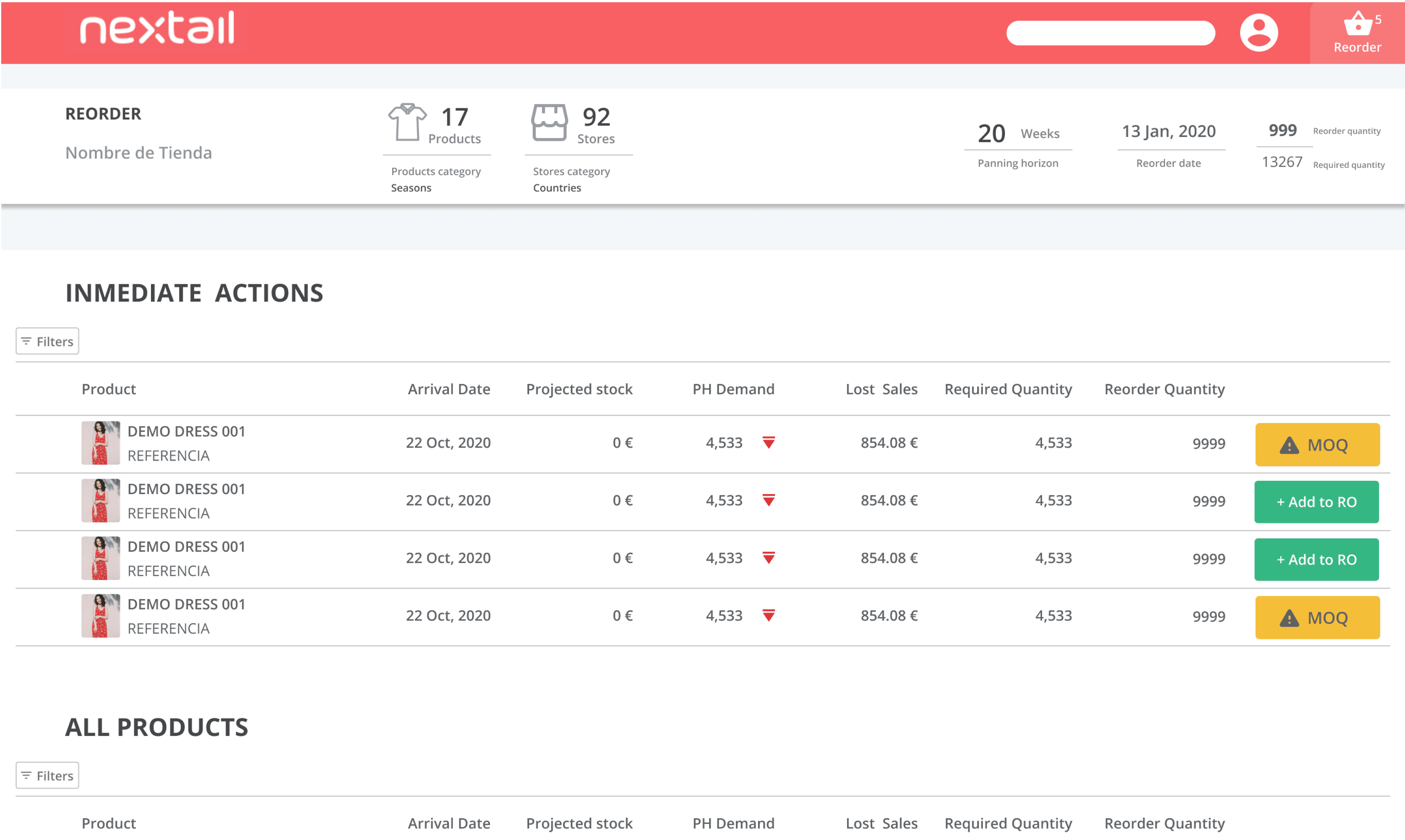
The most important space of the dashboard is reserved for Actions that require immediate attention. This list includes only products that have been identified by Nextail’s AI for re-order.
This way if the store manager is busy and has a limited time to interact with the platform they can go to what matters quickly and efficiently.
The list with all the product is still visible if the user wants to dive into it, but they will have to scroll down for it.
Filters are hidden under a popup (To Be Designed). We should analyze how much do users use filters in order to decide whether to do this or not.
Static information now occupies a much smaller space. It can potentially be reduced further depending on how useful this information is for users.
Alerts are now more visible and look clickable, so the user knows what to do if they want to resolve the warning.

url.com
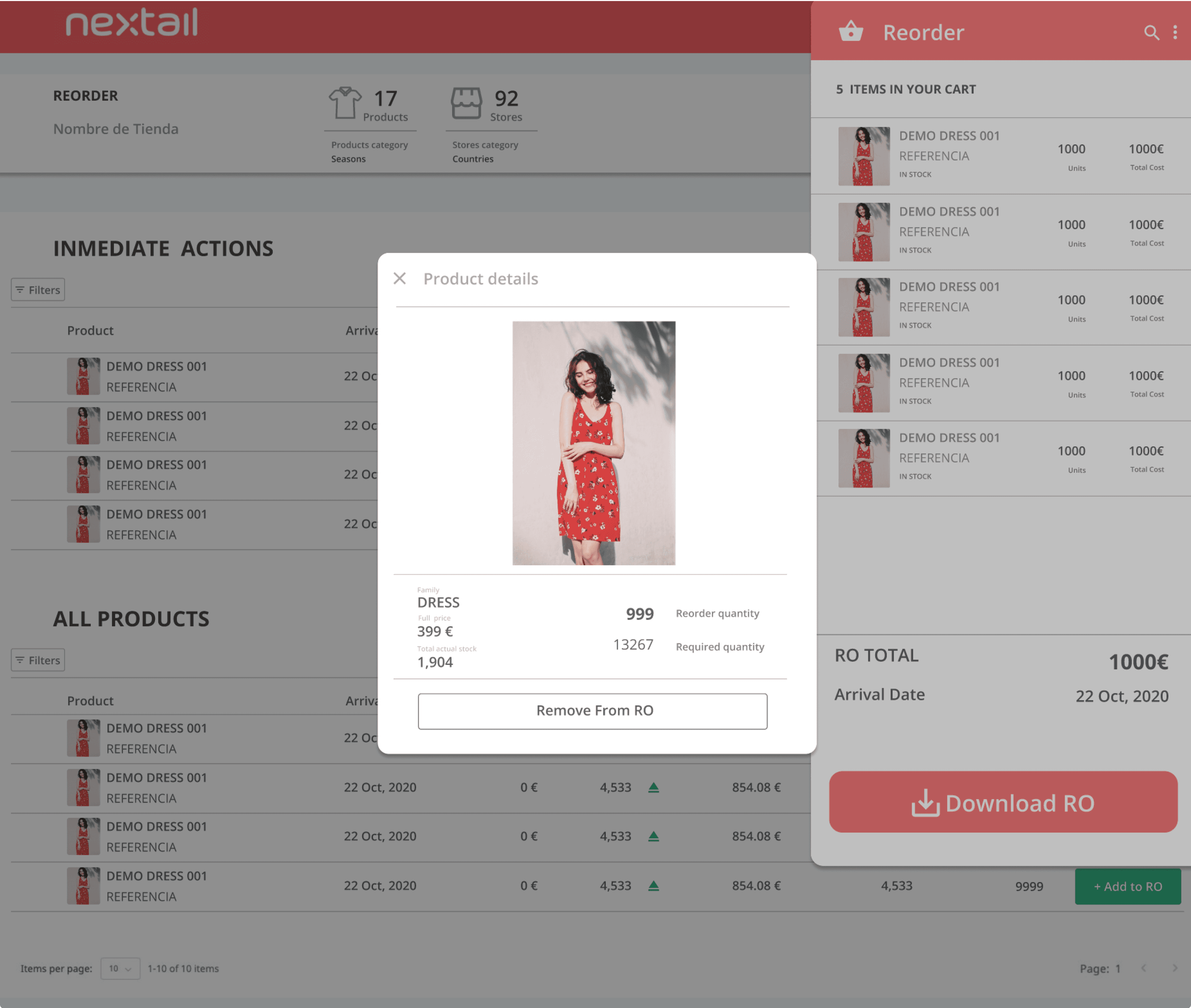
A pop-in shopping cart has been introduced. Store Managers can decide which products to add to the Cart and which not.
Users are already familiarized with the concept of Shopping Carts so it’s an easy concept to introduce.
A darker backdrop that covers the rest of the page is used to make sure the user’s attention is focused where we want it
url.com
Product cards with more information on the product are available in case the user wants to know more without leaving the Shopping Cart.

url.com
Only products that have been filled up to the MOQ can be added to the RO.
The yellow warning will become Green to showcase it can be added to the RO.

url.com
Product Information is now displayed within a popup instead of pushing the layout up and down
Conclusions
url.com
Do users use filters?
☝️ Depending on how much they use them we could hide them or show them by default.
Analytics that measure this use should be inserted.
Do users always add to RO after filling up the MOQ?
🔎 If they do we could automatically add them for them.
Do users check the static information below the topnav?
👩🏻💻 With heatmaps and AB Tests we could hide further that information (make it smaller or hide it within a popup)
Next Steps
Things to be validated with the users
Let´s connect
Have questions about my work? Interested in discussing a project or sharing new ideas? I’d love to connect! Whether you’re curious about the designs you just explored or looking for collaboration opportunities, feel free to reach out. Drop me a message, and let’s create something great together! 🚀
Available For Work